UX Design Internship
Credibly
My Role
Designer + Researcher
Timeline
June 2020 - September 2020, June 2021 - October 2021

Overview
I worked at Credibly for two summers as a UX Research intern. Credibly is a finance-tech lending company that leverages cutting-edge data science, technology, partner relations, and customer support to provide business owners with accelerated access to right-sized capital solutions. They are located in Southfield, Michigan.
So what did I do, exactly?
My job was to provide meaningful insights and design solutions to improve the information architecture of product locations across Credibly’s 12 landing pages, with the ultimate goal of improving on-page conversion rate. I used the digital experience analytics platform Fullstory to uncover how users were interacting with Credibly’s website. I utilized a variety of research tools including user session replays, heatmaps, and conversion funnels to gain insight into user behavior, identify areas of improvement, and to increase engagement and conversion rates.
Design goals
Objectives:
Ensuring user’s desired target page is available and obvious
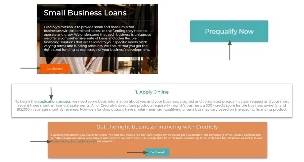
Optimizing call to action placements
Analyzing desktop vs. mobile split and conversion rate
Identifying website bugs and inefficiencies
Target page analysis
Where do users want to go
Depending on where the users wants to go, the company can make more informed decisions on how to optimize user flow
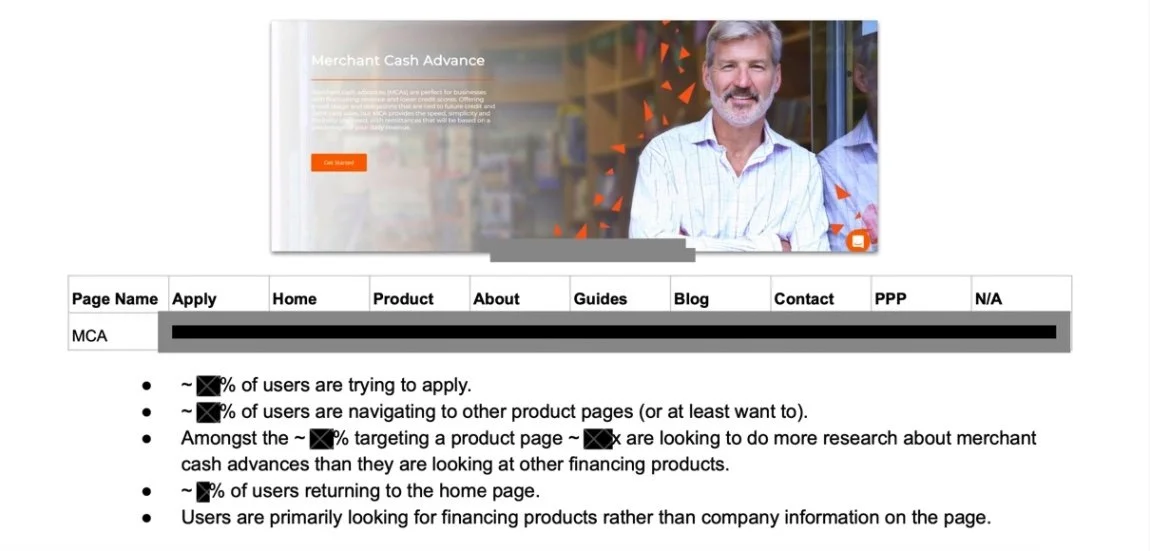
Classified target placements (clicks) into mutually exclusive buckets: Home, Apply, Product, About, Guides, Blogs, Contact, PPP, N/A
Analyzed desired target page in relation to current page
Identified and eliminated recurring rage click/misclick pathways
Framework Example (Data blocked out for NDA Policy):
User navigation analysis
How are users are getting to their desired destination (target page)?
Through assessing how and where users click to get to their end destination, the company gains insights on whether there is enough on page links/buttons for the user and if they are obvious or not
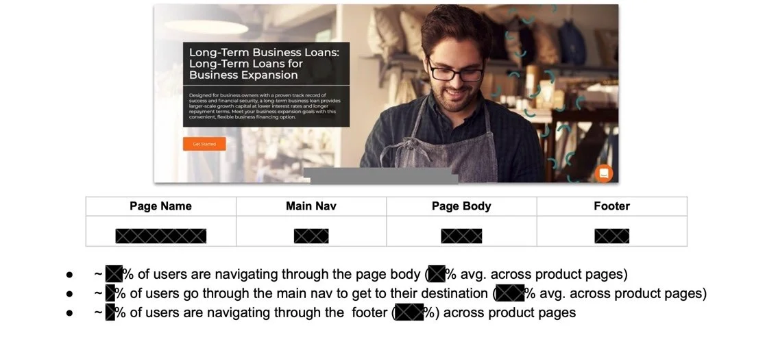
Classified click regions into mutually exclusive buckets: Main header navigation, On-page body clicks, Footer navigation
Analyzed desired target page in relation to current page
Framework Example:
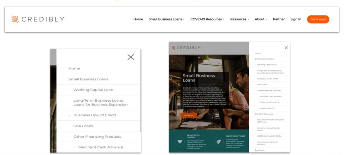
Main Header Navigation
On-Page body clicks
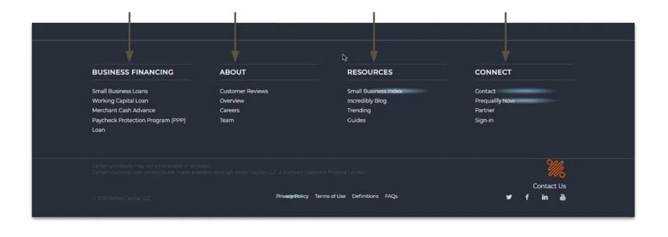
Footer
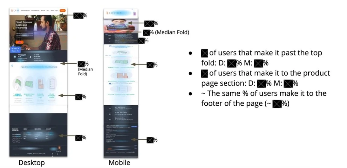
Scroll map analysis
How far do visitors make it through a page?
Assessing drop-offs: At what point a user leaves a page
Analyzing how many of the on-page call to actions are viewed
Helps Credibly better prioritize the sections of the page from top to bottom
Framework Example:
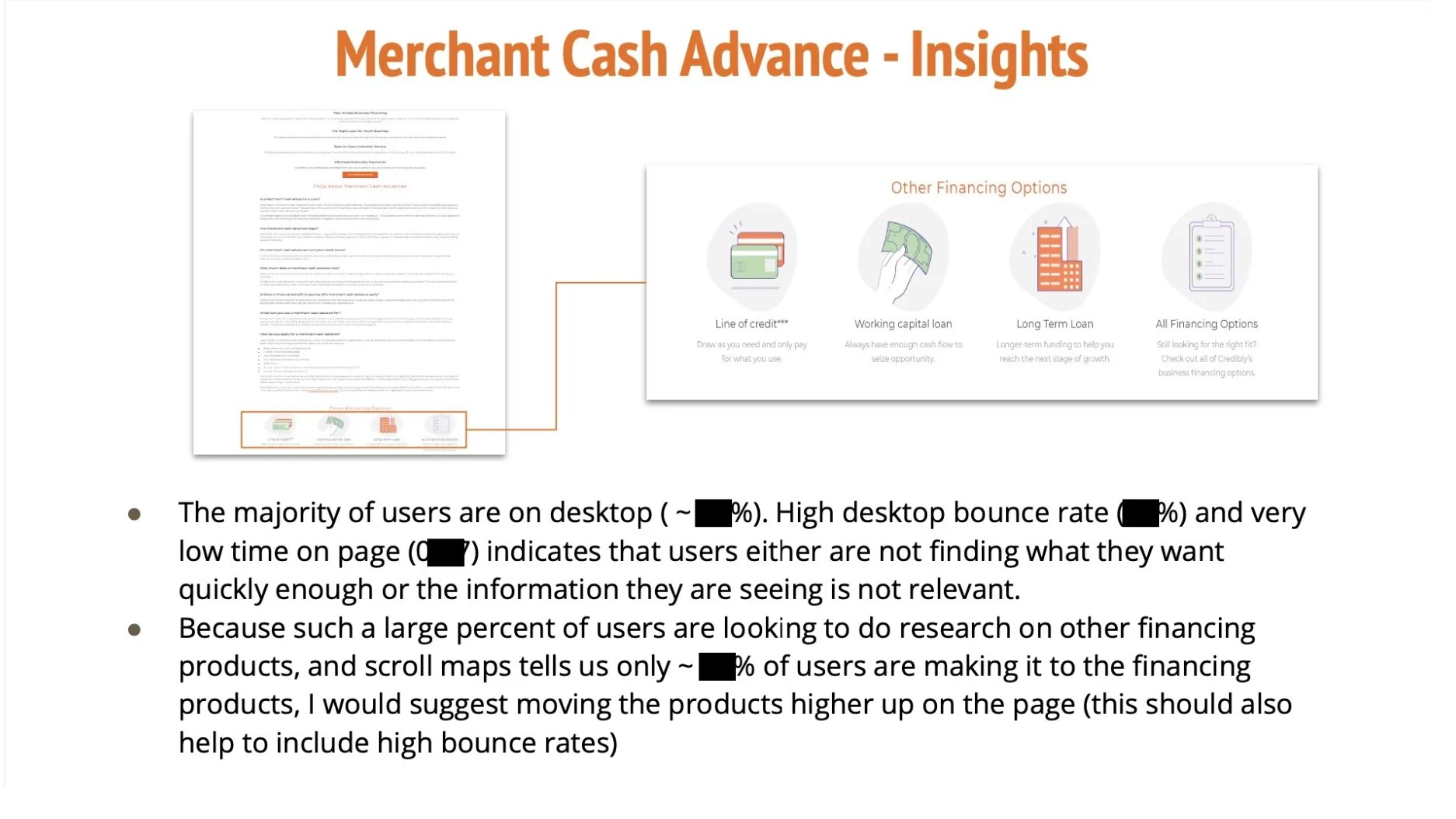
Google analytics data
How can pairing google analytics data with click map and scroll map findings allows us to make more informed decisions regarding strategic UX?
Mobile vs. Desktop split
Bounce Rate by Device Type
Average time on page by Device Type
By comparing pages against each other, we can extract insights regarding how well pages perform relative to benchmark
By comparing mobile against desktop for a specific page, we can extract insights about device type performance
Design solutions from insights
How did the research drive design solutions?
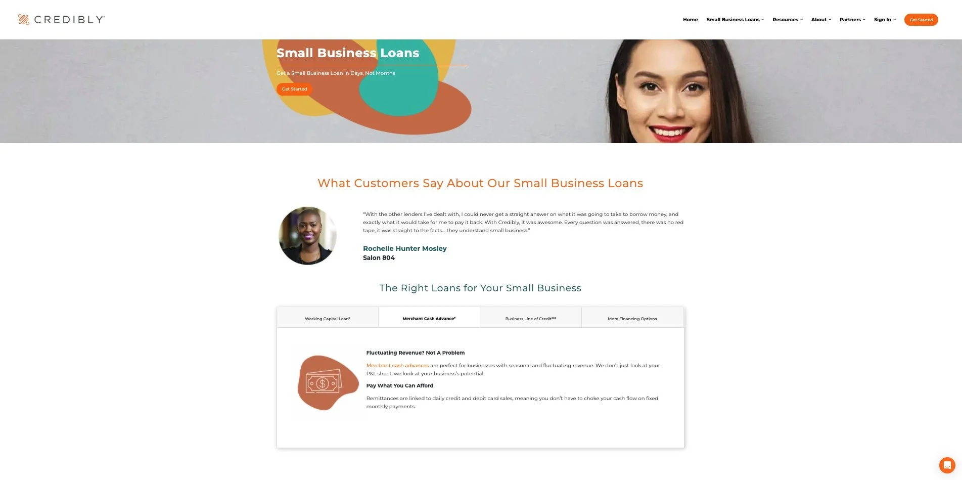
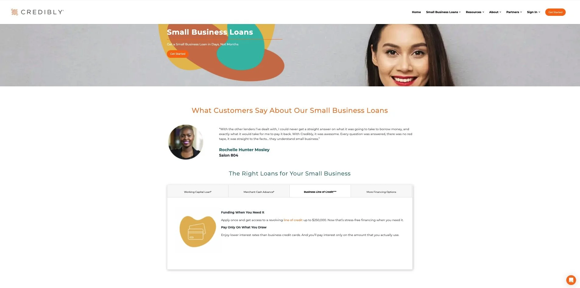
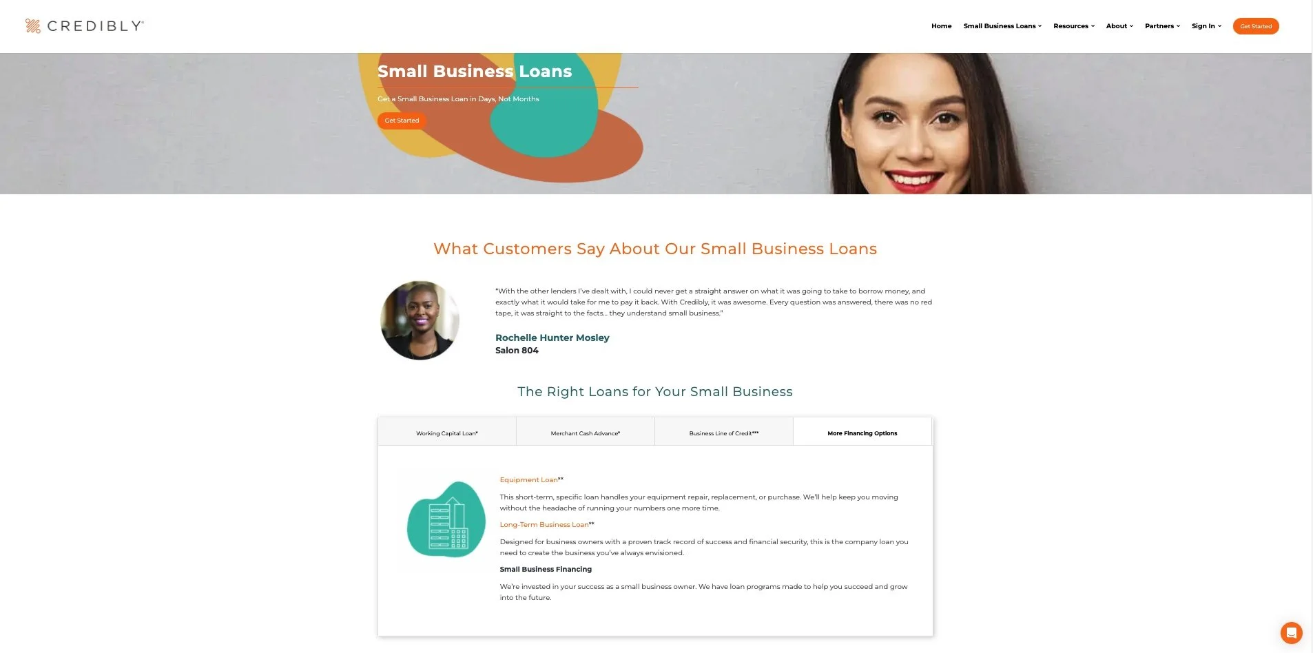
The Information architecture of all 12 product pages was restructured so that users can find what they want faster and not have to search through information irrelevant to them.
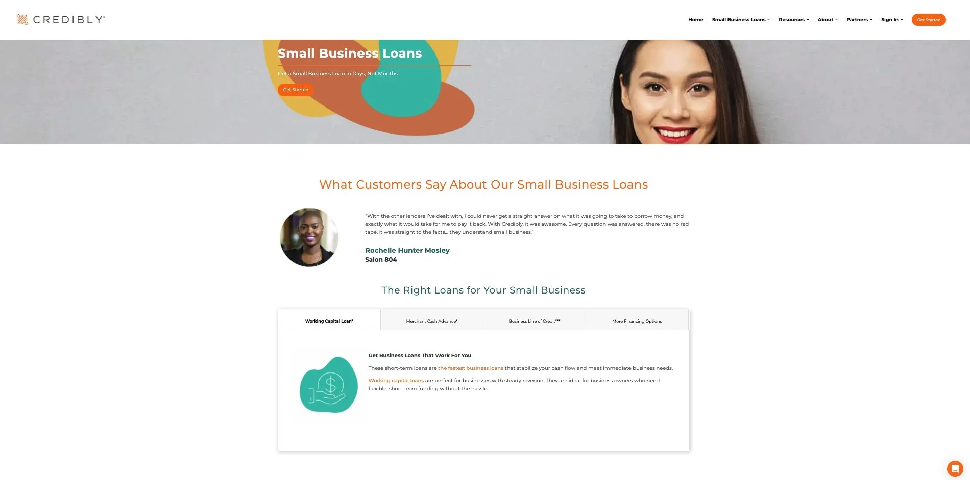
Interactive tabs
What value does this offer to customers?
Instead of having to comb their way through information, users are immediately presented with loan products where they can learn and evaluate their options.
Tab Examples:

